10 YouTube Thumbnail Archetypes That Drive Clicks
Great thumbnails aren't creative accidents — they follow repeatable patterns. Here are the 10 thumbnail archetypes that consistently drive the highest click-through rates, and when to use each one.
You've heard the stat: thumbnails and titles drive 90% of your click-through rate. But here's what nobody tells you — the creators with consistently high CTR aren't more creative than you. They use repeatable visual frameworks.
These frameworks are called thumbnail archetypes. Every high-performing thumbnail on YouTube maps to one of about 10 patterns. Once you know them, thumbnail creation stops being a creative guessing game and becomes a strategic decision.
This guide covers all 10 archetypes — what they are, when they work, and how to execute each one for your channel. If you want a system that generates thumbnail concepts using these exact archetypes, the AI Thumbnail Factory applies them automatically based on your video topic and niche.
What is a thumbnail archetype?
An archetype is a proven visual structure that reliably drives clicks. It's not a template — you still customize the content, colors, and execution. But the underlying composition follows a pattern that viewers' brains recognize and respond to.
Think of it like music. There are only so many chord progressions, but millions of songs. The chord progression is the archetype. The melody, lyrics, and production are your customization.
The advantage of using archetypes: you stop starting from a blank canvas every time. Instead of "what should my thumbnail look like?" you ask "which archetype fits this video best?" That's a much faster question to answer.
The 10 archetypes (and when to use each)
1. The Before/After Split
Split the frame into two halves. Left side shows the problem. Right side shows the solution. The contrast between the two sides is the entire hook.
When to use it: Tutorials, makeovers, skill progressions, room renovations, cooking transformations, editing demos — any video with a clear "before" and "after" state.
Execution rules:
- Desaturated, cool tones on the "before" side — make it look worse
- Vibrant, warm tones on the "after" side — make it look better
- Minimal text. "BEFORE" and "AFTER" labels or a simple arrow. The visual does the talking
- The dividing line should be clean and obvious at thumbnail size
Why it works: Your brain can't ignore a before/after comparison. It's hardwired to complete the transformation story. The viewer clicks because they want to understand how the "before" became the "after."
2. The Reaction Face
Close-up of your face showing a strong, exaggerated emotion — shock, excitement, disbelief, pure joy. The face occupies 40-60% of the frame and must read clearly at 160x90 pixels (mobile thumbnail size).
When to use it: Reactions, surprising results, emotional stories, challenges, unboxings, reveals.
Execution rules:
- Text goes on the opposite side from the face — never overlap
- Name the THING, not the emotion. "IT ACTUALLY WORKED" next to a shocked face. The face handles the emotion; the text names what caused it
- High-contrast solid background behind the face — no busy backgrounds that compete with the expression
- 2-4 words of text maximum
Why it works: Humans are hardwired to notice and respond to facial expressions. A surprised face in a feed of neutral thumbnails is an automatic scroll-stop.
3. The Bold Statement
Large text dominates the frame — 3-6 punchy words that restate the title's hook more aggressively. A simple supporting image or solid color background sits behind the text.
When to use it: Educational content, hot takes, commentary, essays, explainers — especially when there's no natural visual moment to capture.
Execution rules:
- Maximum 6 words. 2-4 is ideal
- Heavy sans-serif font — Montserrat, Impact, Bebas Neue
- Dark outline or drop shadow for readability over any background
- ONE message per thumbnail. If the text and visual say different things, the thumbnail fights itself
Why it works: When you don't have a compelling visual, the text IS the visual. A bold claim in large type creates a curiosity gap on its own.
4. The Mystery/Blur
A key element is blurred, pixelated, covered by a question mark, or hidden behind a colored block. The obscured element IS the hook — people click to see what's hidden.
When to use it: Reveals, surprises, product launches, secret tips, room tours with a hidden feature, "guess what happened" content.
Execution rules:
- Make the blurred area a bright, attention-grabbing color (neon pink, lime green, bright orange) even if that's not its real color
- "???" or a single question mark works as text. Don't over-explain
- Keep the rest of the frame clear for maximum contrast between the hidden and visible elements
Why it works: An information gap you can partially see is more compelling than one you can't see at all. The blur says "there's something here and you're not allowed to see it yet." The brain can't let that go.
5. The Versus Split
Two items, approaches, or options placed side by side with "VS" in the center. Each side is labeled. The composition creates a forced choice.
When to use it: Product comparisons, tool reviews, cheap vs expensive, method battles, debate content.
Execution rules:
- Bold "VS" in the center
- Each side gets 1-2 word labels — product name, price, or approach
- Each side gets its own color scheme. Red vs Blue is classic
- The contrast between halves should be instant and obvious at thumbnail size
Why it works: A forced choice triggers decision-making circuitry. Even if the viewer doesn't have a preference yet, they want to see which side "wins" — and they get that answer by watching.
6. The Countdown Number
A large number dominates the frame — "10," "5," "$100," etc. The number represents a list count, time period, monetary amount, or quantity, and takes up 30-50% of the frame.
When to use it: Listicles, ranked lists, challenges with numerical goals, financial content, milestone videos.
Execution rules:
- The number IS the text overlay. Oversized, bold, thick font
- A brief label beneath if needed: "$100" with "CHALLENGE" underneath
- The number should be the brightest element — white or yellow on dark backgrounds
Why it works: Numbers create instant specificity. "$0 → $10K" is more compelling than "how I grew my income." The number promises a concrete, measurable outcome.
7. The Behind-the-Scenes Peek
A candid, slightly raw shot that gives a peek at something viewers don't normally see. Studio setups, equipment, screen recordings, workspaces, the unpolished version of a polished process.
When to use it: Day-in-the-life, setup tours, process breakdowns, "how I made this," gear reviews.
Execution rules:
- Casual and minimal text. Handwritten-style fonts match the vibe. "MY SETUP" or "THE TRUTH" works
- Warm, natural tones. Authentic and slightly unpolished
- Avoid neon or oversaturated colors that feel produced
- Slight vignetting draws the eye to the center
Why it works: Behind-the-scenes access feels exclusive. Viewers click because they want to see something real, not something produced.
8. The Aspirational Outcome
Show the END result the viewer wants — the dream setup, the final product, the successful outcome. Sell the destination, not the journey.
When to use it: Tutorial outcomes, finished projects, income reveals, lifestyle content, "what you could build" previews.
Execution rules:
- Result-focused labels: "FINAL RESULT," the dollar amount, the metric achieved
- Clean, premium feel. White space, minimal clutter, professional lighting
- Make it look attainable but impressive — not so polished it feels fake
- Think product photography vibes. You're selling an outcome
Why it works: People don't want the tutorial. They want the result the tutorial produces. Show them the result and they'll click to learn how to get there.
9. The Pattern Interrupt
Something visually unexpected or "wrong" that breaks the mental pattern of scrolling. Objects in strange places, impossible scale differences, unusual color treatments, or visual contradictions.
When to use it: Creative content, unique angles on common topics, entertainment, anything where standing out from the feed is the primary goal.
Execution rules:
- Text is optional. The visual disruption IS the hook
- Break color expectations — monochrome with one vibrant element, inverted colors, anything that looks "off" in a feed of normal thumbnails
- The weirdness must connect to the video's content. Random disruption without meaning feels like clickbait
Why it works: Your brain has a scrolling pattern. It quickly categorizes each thumbnail as "seen this before" or "what is that?" A pattern interrupt forces the second category.
10. The Social Proof Stack
Showcase evidence that other people validate your content — comment screenshots, view counts, testimonial quotes, crowd reactions, or metrics that signal "this is worth your time."
When to use it: Results-oriented content, viral recaps, community-driven videos, "everyone's talking about this" topics.
Execution rules:
- Real quotes or numbers from actual results. Authenticity is critical — fake social proof backfires immediately
- "10M VIEWS" or a real comment screenshot
- Match the platform's UI colors for screenshots (YouTube red, Twitter blue) to give the social proof visual credibility
- Frame the evidence cleanly — no cluttered screenshots
Why it works: Social proof is a cognitive shortcut. "If 10,000 people watched this, it must be worth my time." The number does the selling.
How to pick the right archetype for your video
Three questions. Answer them and the right archetype reveals itself:
-
What emotion should the viewer feel? Curiosity → Mystery/Blur or Pattern Interrupt. Surprise → Reaction Face or Countdown Number. Desire → Aspirational Outcome or Before/After Split.
-
What's the video's structure? List or ranking → Countdown Number. Comparison or debate → Versus Split. Tutorial or transformation → Before/After Split or Aspirational Outcome.
-
What's in the frame? You and your face → Reaction Face or Behind-the-Scenes Peek. Objects or results → Bold Statement or Aspirational Outcome. Data or proof → Social Proof Stack or Countdown Number.
Most videos map to 2-3 plausible archetypes. That's by design — generate 3 concepts using different archetypes and pick the strongest one. The AI Thumbnail Factory does this automatically: you provide your video title and context, and it outputs 3 ranked concepts using different archetypes with full design specs.
Niche-specific archetype defaults
Some archetypes consistently outperform others in specific niches. Use these as starting points, not rules:
| Niche | Best archetypes | Why |
|---|---|---|
| Tech/Reviews | Bold Statement, Versus Split, Dark Mode aesthetic | Viewers want clarity and comparison |
| Cooking/Food | Before/After Split, Aspirational Outcome | Transformation is the content |
| Gaming | Reaction Face, Pattern Interrupt, Countdown Number | Energy and curiosity drive clicks |
| Fitness | Before/After Split, Countdown Number, Reaction Face | Results and challenges are the hook |
| Finance | Countdown Number, Social Proof Stack, Bold Statement | Numbers and proof sell |
| Education | Bold Statement, Before/After Split, Mystery/Blur | Knowledge gaps are the content |
| Vlog/Lifestyle | Behind-the-Scenes Peek, Reaction Face, Aspirational Outcome | Personality and aspiration |
If your niche isn't listed, look at the top 10 channels in your category. What visual patterns do their best-performing thumbnails share? That's your archetype signal.
From archetype to finished thumbnail
The archetype gives you the structure. Execution makes it real. Here's the fastest path for each one:
- Pick 1-2 archetypes that fit your video (don't try to blend them)
- Write the text overlay — under 5 words, bold font, high contrast
- Choose your color palette based on the archetype's rules and your brand
- Get the base image — take a photo (faces), use AI image generation (backgrounds/objects), or search stock photos
- Layer text and branding in Canva or your design tool
- Check at thumbnail size — if it's unreadable at 160x90, simplify
For AI image generation prompts matched to each archetype, the AI Thumbnail Factory includes ready-to-paste prompts for GPT Image 1.5, Gemini 2.5 Flash, and other models. It saves you from writing prompts from scratch and ensures the output aligns with the archetype's composition rules.
Don't use the same archetype every time
Consistency in quality matters. Consistency in archetype doesn't.
If every thumbnail on your channel uses the Reaction Face archetype, viewers start scrolling past because the pattern becomes predictable. The highest-CTR channels rotate between 3-4 archetypes based on the video type.
A practical approach: pick 3-4 archetypes that suit your content and rotate between them. Use Reaction Face for emotional content, Bold Statement for educational content, Before/After Split for tutorials, and Mystery/Blur for reveals. This gives your channel visual variety while staying recognizable.
The archetype system in action
Here's what the workflow looks like for a real video:
Video: "I Tried 5 AI Tools for Video Editing — Only 1 Was Worth It"
Archetype A — Versus Split: Left side shows 5 tool logos labeled "TRIED THEM ALL," right side shows a single green checkmark with "ONE WINNER." Works because comparison IS the content.
Archetype B — Reaction Face: Your face (surprised/disappointed expression), dark background, text "NOT WHAT I EXPECTED." Works because the surprise element creates a curiosity gap.
Archetype C — Countdown Number: Large "5" on the left, small "1" on the right with an arrow. Text: "ONLY 1 WORTH IT." Works because the number reduction creates visual drama.
Three archetypes, three distinct concepts, one 60-second brief. That's faster than opening Canva.
Next step: stop guessing, start choosing
The next time you're stuck on a thumbnail, don't start with a blank canvas. Start with a question: "Which archetype fits this video?" The answer cuts your decision time from 45 minutes to 5.
If you want the archetype selection and concept generation handled for you, the AI Thumbnail Factory applies all 10 archetypes automatically. Feed it your video title and niche, and it returns 3 ranked concepts — each using a different archetype — with layout specs, text overlays, color palettes, and AI image generation prompts.
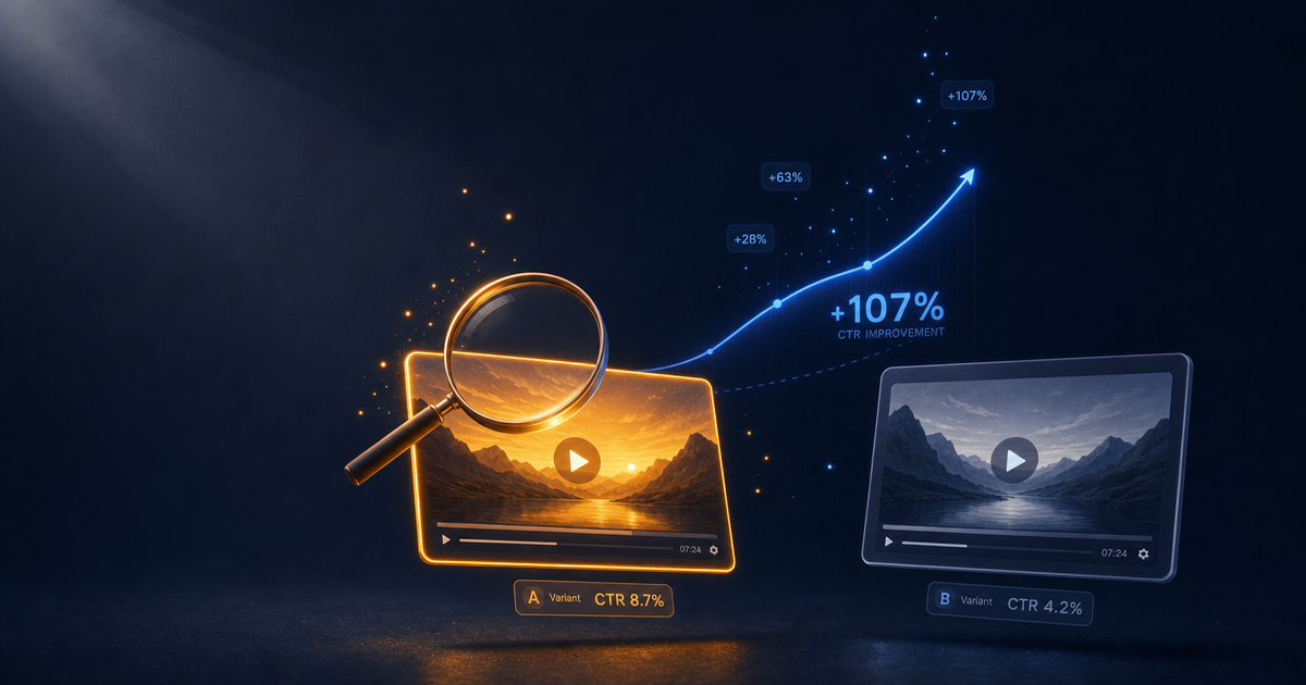
And when you want to test which archetype actually wins for your audience, the Thumbnail A/B Test Analyzer turns your CTR data into insights about what's working and why. Browse the full Titles & Thumbnails collection for more tools in this space.
Pick the archetype. Execute it. Ship the video. Repeat.
About the author
CreatorSkills.co
The CreatorSkills team publishes practical guides on AI workflows for content creators.
About CreatorSkills