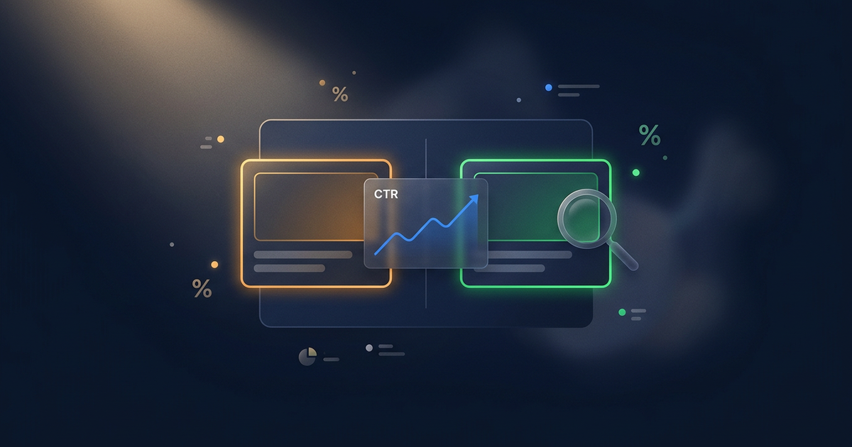
AI Social Media Post Templates for Every Platform (Visual Guide)
You need different visuals for Instagram, LinkedIn, TikTok, X, and Pinterest — but making five versions of every graphic isn't realistic. AI social media post templates let you generate platform-fit visuals from one core concept in minutes.
You published a new piece of content. Now you need to promote it on Instagram, LinkedIn, TikTok, X, and Pinterest. Each platform wants a different image format, a different visual tone, and a different composition. Making five separate graphics from scratch takes longer than creating the content itself.
So you do what most creators do: you make one image and post it everywhere. Same square crop, same composition, same vibe. It looks fine on Instagram, weird on LinkedIn, and gets cropped badly on Pinterest.
This is a workflow problem, not a design problem. And AI prompt templates solve it by letting you generate platform-specific visuals from a single concept — with consistent branding across all five platforms.
One prompt doesn't fit all platforms
If you've used AI prompts for social media captions, you know that each platform has different text expectations. The same applies to visuals, but the stakes are higher because a wrong-sized image literally gets cropped or distorted.
Here's what each major platform actually needs:
Instagram feed (1:1 or 4:5) — One bold focal subject. High color contrast that pops in a fast-scrolling feed. Space in the lower third for overlay text if needed. Simple composition beats complexity at mobile thumbnail size.
LinkedIn (1.91:1 or 1:1) — Calmer palette. Cleaner geometry. Trust and authority signals over hype. Reduce decorative elements. Think "polished editorial" not "attention-grabbing social."
TikTok cover (9:16) — Maximum contrast and an immediate visual hook. Center the subject for crop safety. The background needs to survive being seen at tiny cover-thumbnail size in the For You grid.
X / Twitter card (16:9) — Horizontal balance. Crisp edges and minimal clutter. One surprising visual element beats many small ones. These display inline on the timeline, so they need to work at reduced size.
Pinterest pin (2:3) — Vertical composition with strong visual hierarchy. Clear top-to-middle-to-bottom flow. Texture and depth boost save rates. Pinterest is the one platform where more visual detail actually helps.
Using one generic prompt for all five guarantees that at least three outputs won't fit their platform.
The visual system approach
Instead of writing five separate prompts from scratch for every post, build a campaign visual system that translates one concept into five platform-ready outputs.
A visual system has six components:
- Primary palette — 3 colors max with hex codes. These show up in every output.
- Contrast rule — What must be visible first on a small mobile screen.
- Visual motif — A recurring design element (gradient direction, shape treatment, border style) that ties outputs together visually.
- Composition default — Where the focal subject sits. Consistency here is what makes people recognize your content across platforms.
- Safe-zone rule — Where overlay text can go without competing with the subject.
- Continuity element — One thing that appears in every platform version. Could be a color accent, a corner motif, or a consistent lighting direction.
Define this system once, and every future post starts from a proven foundation instead of a blank canvas. The system travels with you — it works whether you're running prompts in ChatGPT, Flux, or Midjourney.
Platform template families that work
Once your visual system is defined, you need template families for common post types on each platform. Here are the ones that consistently produce usable results:
Instagram feed visual
Best approach: one bold subject with high-contrast background. Leave negative space for optional text overlay. The image needs to work at thumbnail size in the grid, so complexity is your enemy. Think of it as a mini poster — one idea, one emotion, maximum clarity.
Instagram carousel cover
Different from a feed post. The cover needs to work as both a standalone visual and the first frame of a series. Leave headline-safe space in the top or center. The visual motif should hint that there's more content to swipe through.
LinkedIn thought-leadership visual
LinkedIn audiences respond to credibility signals. Calmer palettes. More structure, less decoration. Think "conference slide" aesthetic — clean, confident, and organized. Avoid the bright, attention-grabbing treatments that work on Instagram. They feel out of place here.
TikTok cover frame
This is the one image that represents your video in grids and search results. Center the subject for crop safety. Use the highest contrast treatment in your system. The background needs to be legible at cover-thumbnail size, which is tiny.
X engagement card
Horizontal format. One focal element with balanced negative space. Crisp edges and minimal visual noise. The goal is to make someone pause mid-scroll on a text-heavy timeline, so the image needs to offer a clear visual break from surrounding tweets.
Pinterest pin
This is the platform that rewards visual depth. Vertical composition with a clear hierarchy from top to bottom. Texture, layering, and dimensional depth increase save rates. Unlike other platforms where simple wins, Pinterest users actually engage more with richer visuals.
Model-specific prompt adaptation
The same visual concept needs different prompt syntax for each AI model. This is the part that trips up most creators — what works in ChatGPT doesn't translate directly to Midjourney.
ChatGPT image generation — Write in clear natural language. Describe the scene setup, subject placement, palette with hex codes, mood, and constraints. End with the aspect ratio. Think of it as writing instructions for a photographer.
Flux — More concise. Lead with the dominant subject and framing, add lighting and texture cues, then color anchors. Skip the storytelling; Flux wants signal, not narrative.
Midjourney — Keyword clusters with structured parameters. Subject keywords, style/mood keywords, framing notes, then the parameter tail (--ar 4:5 --stylize 150 --v 6). Don't write full sentences — Midjourney interprets keywords more effectively.
Running the same concept through all three models gives you more options to choose from. And because your visual system keeps the brand rules consistent, the outputs from different models still look like they belong together.
From one campaign to five platforms in under 15 minutes
Here's what the full workflow looks like in practice:
- Define campaign brief — Goal, topic, audience, platforms in scope. 2 minutes.
- Load your visual system — Already defined from initial setup. Zero work.
- Select template families — One per target platform. 1 minute.
- Generate model-specific prompts — The system outputs prompts for each platform/model combination. Instant.
- Generate A/B variants — One controlled variation per platform concept for testing. Automatic.
- Run prompts and select winners — Generate across your preferred model(s), pick the best output per platform. 10 minutes.
Total: one campaign concept, five platform-ready visuals, plus A/B variants for testing — in under 15 minutes.
Without a system, this same task easily takes 2-3 hours. And the results look inconsistent because each platform's graphic was made in a separate Canva session with no shared rules.
When templates beat custom prompts
Custom prompts make sense when you're doing something genuinely unique — a product launch hero image, a rebrand announcement, or a one-time event graphic. For those, invest the time in crafting a specific prompt.
For everything else — the 80% of social posting that's regular content promotion — templates are faster and more consistent. You're not trying to reinvent your visual identity every Tuesday. You're trying to get a good-looking, on-brand graphic for each platform and move on to making more content.
That's exactly what the Social Media Visual Template Pack is built for. It gives you platform-specific prompt templates for Instagram, LinkedIn, TikTok, X, and Pinterest, with model-specific variants for ChatGPT, Flux, and Midjourney. Set up your visual system once, and every campaign runs through the same proven workflow.
What to do next
If you're posting on 2+ platforms: Pick your next piece of content and try generating one visual per platform using the same concept. Notice where the composition breaks — that tells you which platform needs the most adaptation.
If you want a ready-to-use system: The Social Media Visual Template Pack includes templates for all six platform formats with A/B variant generation built in. It's $24 and it replaces the "make one image and crop it five ways" workflow.
If you're also creating thumbnails: Check out the AI Thumbnail Factory for YouTube-specific thumbnail generation, or browse the full Image Generation for Thumbnails category for the complete toolkit.
About the author
CreatorSkills.co
The CreatorSkills team publishes practical guides on AI workflows for content creators.
About CreatorSkills